Hud-projection mod
-
@Ara’:
FanofBMS432 - what is your opinion on the HUD mod, the pics of which were posted above by TwoJay…?
Would you recommend that one (which - I believe - is a simple tweak of YOURS), or - is your vanilla mod in your original post (many, many pages back) better (in your opinion)…?
I’m interested in your recommendation.
Cheers, Aragorn.
Hey Ara
Good to see you around after all these years m8!
")
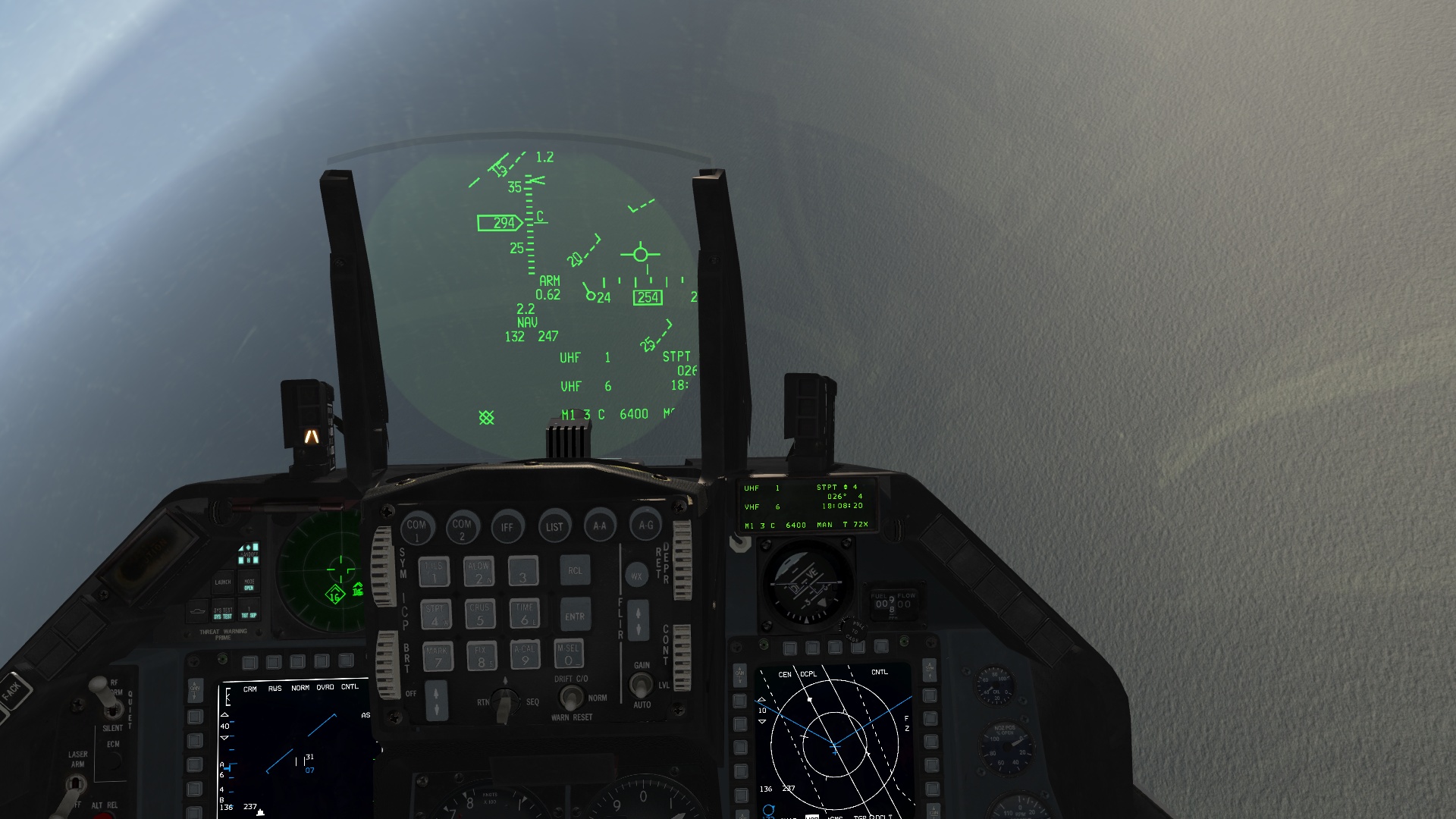
- if one flies ‘stock’ that is with no colors, AND does not fancy some enhancement in the field of reflections of e.g. the symbologyprojector in the HUD-itself, than the stock version will do. I haven’t tested update 4 (yet), but the 3993.dds file has a non-optimal alpha channel in version 3 still. This results in symbology ‘walking’ outside the edges of the green area.
- I recommend for those who want maximum visibility at once and don’t mind the above effect: don’t use custom files.
- I recommend for those who do want a sharp cut-off (you may ask Bushmaster on his opinion on this, he knows EXACTLY what is meant by this) use my 3993.dds
EDIT: THIS IS MY POINT CONCERNING SYMBOLOGY BLEEDING OFF WELL OUTSIDE THE GREEN AREA: I JUST TOOK IT OUT OF THE THREAD ON HUD TIRVIEW-TROUBLE (DED VISIBILITY / REFUELLING)
https://www.benchmarksims.org/forum/attachment.php?attachmentid=14341&d=1357792465
for those who like color schemes, I recommend this:
- with TrackIR (or similar software) you can use fatcap’s version if my ‘sliding panel’ issues don’t show (that would mean indeed my setup); I don’t know, I haven’’ t tested them. I assumed they were developed on their own, but I may be wrong. If you like their colorscheme: use theirs
- Use my 8005.dds (downloadable through mediafire still). You’re just ‘good to go’ (WITH 3993.dds file that is!) if you’d want to get a close effect to RL pics & footage of 217 pics reference (colorcopied), and lighting/shade-tested in almost all thinkable weather/time setups within BMS: to get the max overall results, INCLUDING an symbology-visibility on the HUD that is almost free from disturbance !!! and is maximum dark-green as possible. (this was the result of over 100 hours lighting testing to get the max out of BMS with regard an optimal alpha-channel setup for as well the 3993 as the 8005.dds files and how THEY interact with eachother)
- without TrackIR: either will do, just pick the one with the color you like best (still you’d might prefer my 3993.dds though)
ok, I think I made my point here
as always: feel free to choose whatever you want & happy huntin’ !!!
High regards,
FanNote: please bear in mind that FatCap and his companions also put lots of effort in making something work and to their liking. I do have a lot of respect for this and welcome any improvement in that respect.
-
Cheers, dude.
I think that I’ll revert back to your “vanilla” mod from many pages ago. I did download it when I first came upon this thread.
I then “updated” to the “My Mod of Fan of BMS 432” mod. (Because - TwoJay’s pics were so tempting. Saucy Twojay…!)
The only pics which didn’t really grab my fancy were Fatcap’s. Then - along comes a Real Life HUD-User and says: “They’re perfect.”
Colour me fukin’ CONFUSED…! :mrgreen: Then again - HE is an “ex-DJ”. So, not sure I’m hip to his tastes.
All I can do now is fall back to my old staple: YOU are from the Netherlands. THAT point is more than good enough for me, old chum…!
Arapr0n :drink:
-
@FanOfBMS:
Well … If you can bring something like I’ve asked you about the reflection of the lens … no problem to use it.
But currently, the version proposed by Fatcap seems to me the best compromise. I will test it of course (no Track IR ATM moment here) … but as soon as I’m back to home I will deeply try it.
Problem with your version is the exaggerated green reflection of the edge of the lens which is degraded/dimmed.
Give me something looking similar to Fatcap one including your adjustments and I will see what we can do.
ASUSTeK ROG MAXIMUS X HERO / Intel Core i5-8600K (4.6 GHz) / NVIDIA GeForce RTX 3080 Ti FE 12GB / 32GB DDR4 Ballistix Elite 3200 MHz / Samsung SSD 970 EVO Plus 2TB / Be Quiet! Straight Power 11 1000W Platinum / Windows 10 Home 64-bit / HOTAS Cougar FSSB R1 (Warthog grip) / SIMPED / MFD Cougar / ViperGear ICP / SimShaker JetPad / Track IR 5 / Curved LED 27'' Monitor 1080p Samsung C27F396 / HP Reverb G2 VR Headset.
-
@FanofBMS
Hey mate I saw you pointed out my name several times in your above posts so I guess I should defend myself by making some clarification…
1. You have put in much more time into the HUD project than I have, and you know how the two dds files work much more clearly than I do, so you’re the man and here’s all my respect to you.
2. Due the above fact, I had given up on modding the HUD for the BMS community since you took over the project and I believed you could nail it. My HUD mod V2 version was never released on this forum till several days ago, I had only put it up on my Chinese forum in Nov 2011 for the use of my squadron mates.
3. The V2 version was made simply because I like my own mod better and it was never my intention to release it here on the BMS forum, not to say to be included in future BMS versions… It was when I saw Deejay mentioned my mod in recent posts that I decided to chime in and provide my new work. And then, as you said, “the community effort switched over so easily from lane A (our joint effort) to lane B (FatCap’s line)”. That was not even expected by me.
4. My squadron mate G.R told me he has edited the 8005.dds based on your work. So you will definitely get your credit if it’s going to be accepted by BMS.
Ok, below are the technical issues… I haven’t got G.R’s version yet so all the testing were done on my V2 version. Will test it when I got his files.
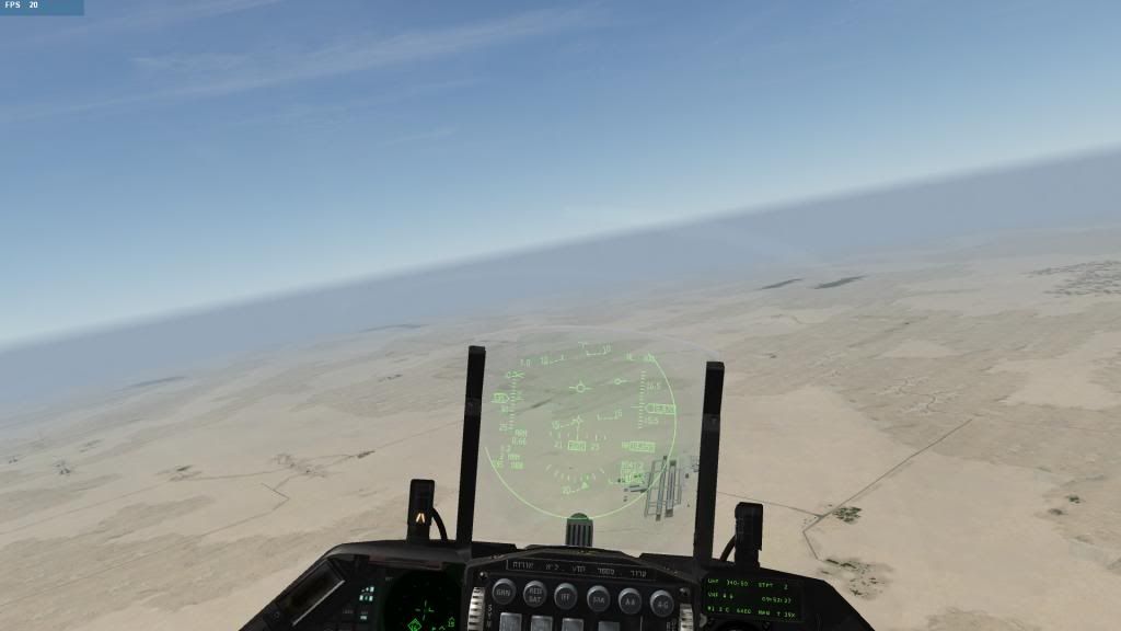
1. I don’t really understand the sliding panel problem. I didn’t notice any problems when I’m using TIR… see pics below…
2. Personally I think the projection circle is only slightly larger than RL which is absolutely acceptable in terms of realism. Also I have a feeling that MLU and US Block 50/52 do not share the same HUD system. The MLU’s HUD has a smaller projection area. Please correct me if I’m wrong.
3. Not really sure about top art or any other issues as I haven’t tested G.R’s version yet.
Cheers,
Fatcap.
-
Thank you very much for stepping in and explaining the above.
The approach you took of course also works for a large part, and might be better than what I did. No problem whatsoever m8.
I’m not going to extensively point out details a - z, no use, but if I may, let me try my best guess to what you did in comparisson to my version:
1. you took th 8005.dds, removed the ‘green part’ and replaced it with a color of your liking
2. you took the original 3993.dds version, topped it of (the flat-top part version), and used that fileI can see that the basic setup is my 8005.dds, but as I said earlier in this topic: of course, for ANYONE: feel free to alter/ upgrade / destroy
or do with it as you please. So really, truly no hard feelings m8The only ‘issue’ with this setup, is that there will always be the outline of the green circle. That is caused by the 3993.dds and the way this is setup. This file projects this light green circle at all times on top of anything one put in the 8005.dds file.
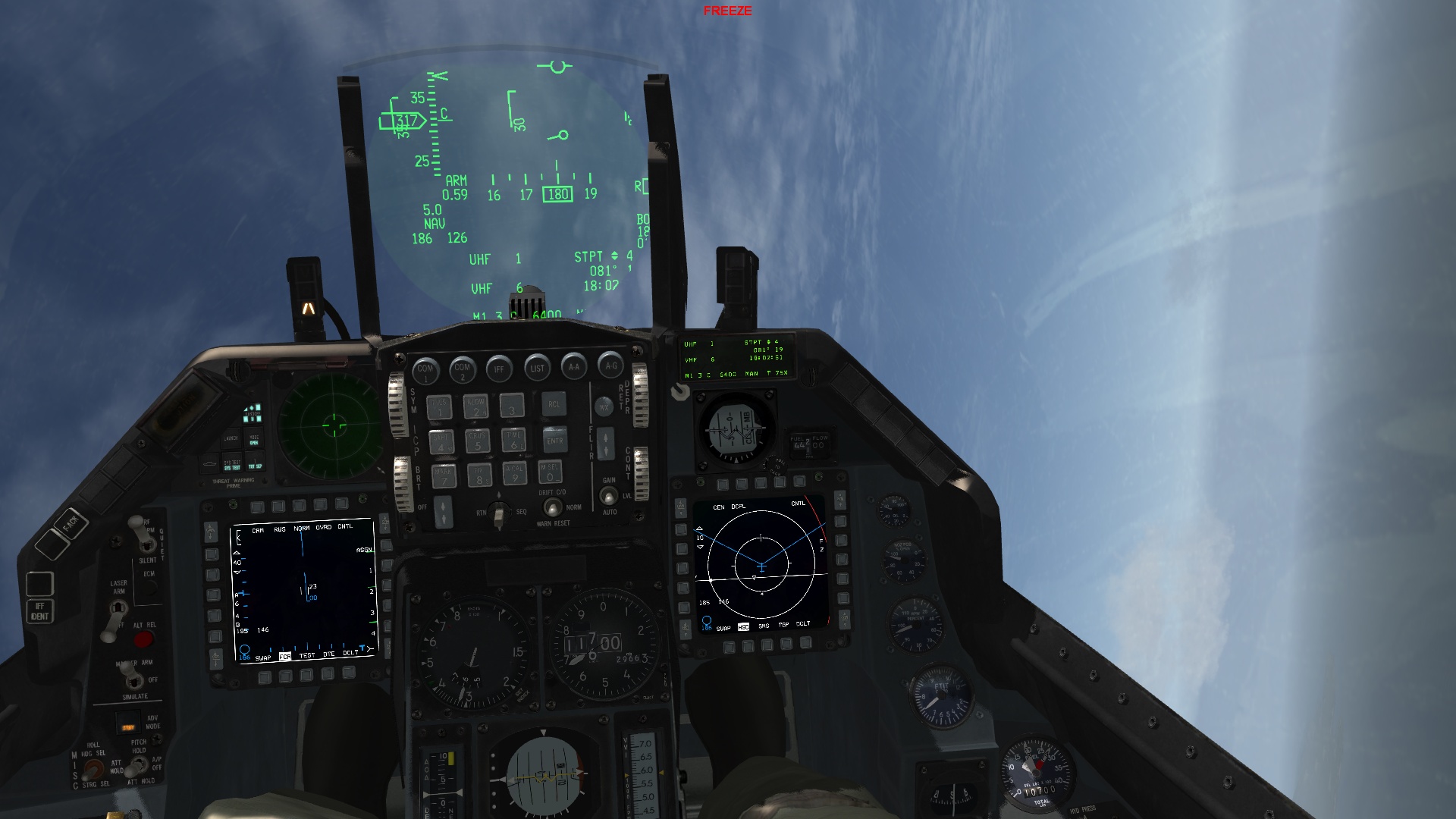
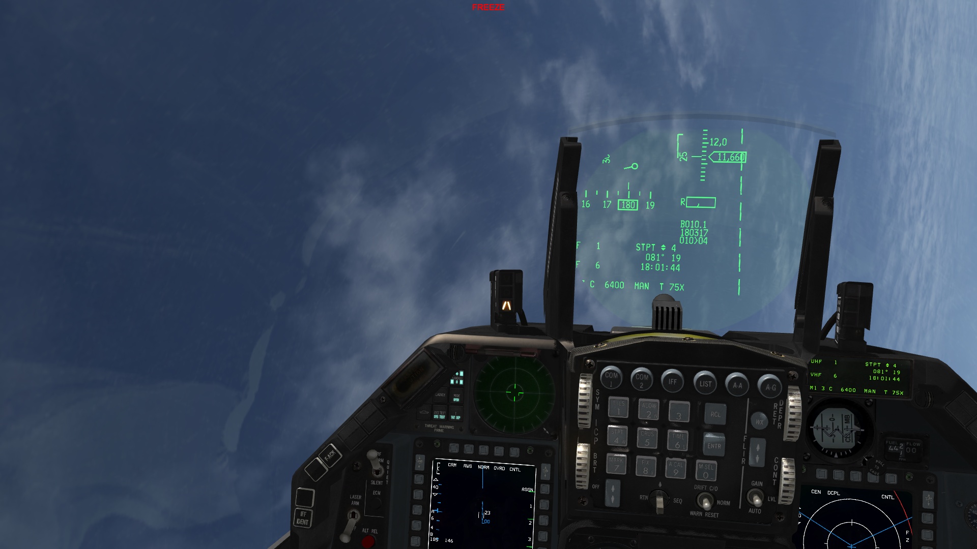
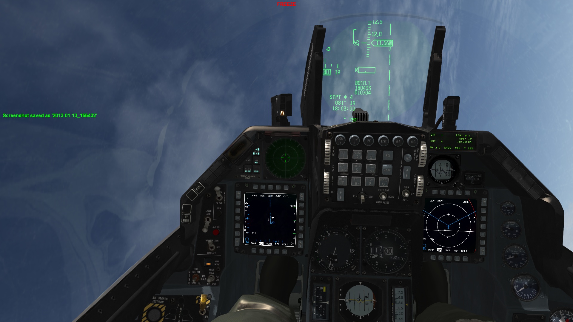
In my setup, with different ingame angles one lookes outside the cockpit this area almost completely merges with the so called: Out The Window visuals. This means that only the symbology is visible, not the green area. This is also seen on RL pics, where only the symbology itself is visible and not the green area. AS THIS WAS ONE OF HE PRIMARY GOALS OF MY SETUP, my resulted 8005.dds TOGETHER with my 3993.dds achieved this the best way possible im my opinion, conserving the possibility to introduce a color scheme.
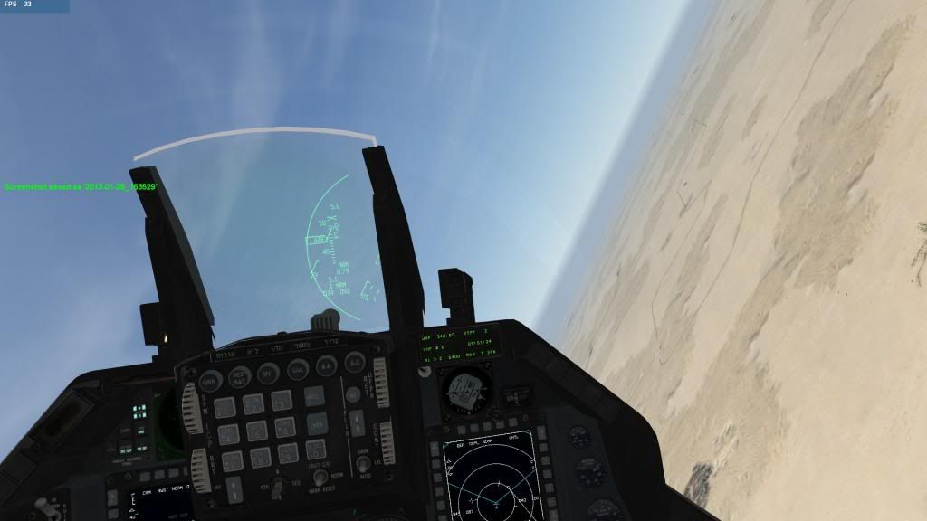
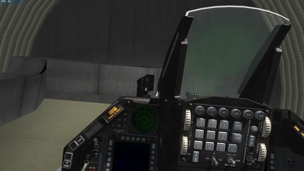
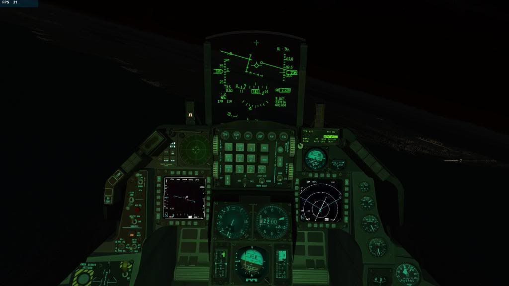
let me show you 3 pics for reference to what I mean:
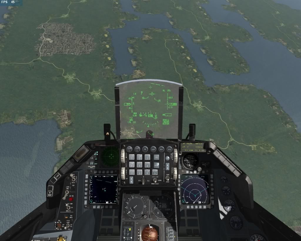
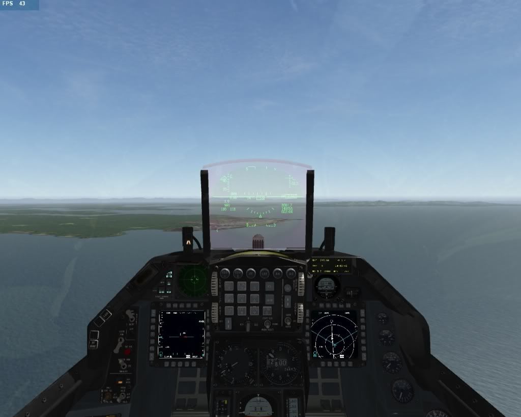
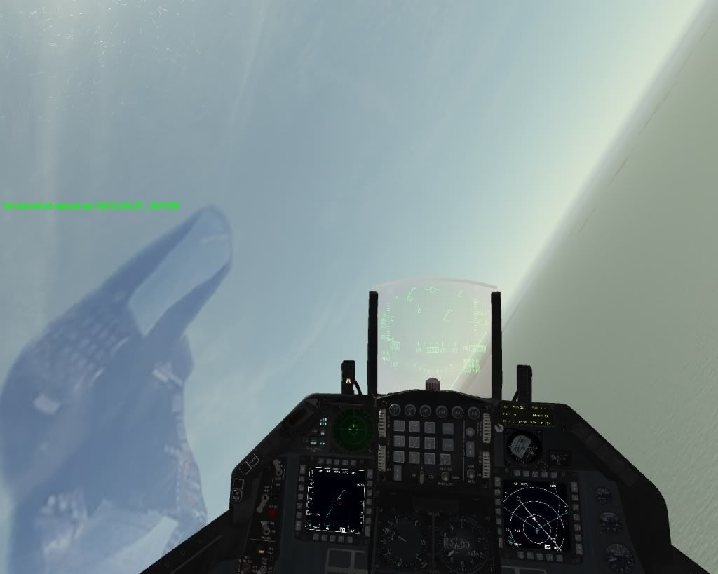
Of course, if - as Dee-Jay implies
- a version is preferred were the outline edges of the green projection circle itself are razor-sharp: take your version, as this is deliberately blurred to a minor extend in my version, for reasons stated earlier.If one would prefer a version, where some sort of dynamics exists as to more-or-less visibility of this area, depending on the intensity of the lighting conditions: well, I feel my setup suits that goal better.
Ok, to sum up: different lanes alright!
Well, thanks again - so for your kind words! - and after all it’s here about details, not about mission critical flying things Happy huntin’ !
High regards,
Fan -
Hey Fan,
Thanks so much for your kind words too I really appreciate it!:p
What I did was actually very simple indeed:
1. Remove the green shade on the lower left of the original 8005 file.
2. Add an appropriate green shade onto the RGB channel of the original 3993 file.
3. Delete and rebuild the collimation mask which is controlled by Alpha 1 channel in the 3993.dds. That took the longest of my time to get it just right.So yes the projection circle is razor-sharp cutting out the symbologies ruthlessly, and that is exactly what I’m after in the first place. And as you said in your version that is deliberately blurred - that’s what I meant “not going in the direction where I’d personally prefer”… Indeed, different lanes!:rolleyes:
Cheers man!!
-
ok guys, now i am tumbleweed…what is currently the recommended mod if one would ask to have his HUD as realistic as possible in reference to the blk 50/52 's? Currently i use CrazyTom’s mod.
| AMD RYZEN9 5900X | ASUS RTX 4080 | G.SKILL 3200-C14 32GB | ASUS X570-E GAMING | LG 27GP850 2K/QHD |
| TM HOTAS COUGAR + MOD | VPC WARBRD BASE | MFG CROSSWIND V2 | G.TRIX JETSEAT KW908 | HP REVERB G2 | -
… hmmm it depends on how you perceive ‘as realistic as possible’
you should add the squadron you’d like to fly with, because some blk 50/52’s make use of this violet teint, not all.
I’d say: try both versions: FatCap and mine.
For your info: the version CrazyTom supplied is one of my versions. I made a custom version for him, with a gold-color overlay over the canopy, with different scratches. He then adjusted some colorteints a bit more pronounced to his liking (I believe he put more ‘blueish’ in it)
Regards,
Fan -
Fresh from the oven I believe… first seconds I believe will be very Enlightening and I don’t thing u would want more zoom…
Also compared to this I believe FanOfBMS432 is a winner here…
Watch also at 4:27… I can clearly see FanOfBMS432 signature on the right bottom corner of the HUD… :lol:
HOT LIST
System Specs:
i7-2600K @ 4.8 Ghz WaterCooled / 32GB Ram. 2TB SSD/1TB SSD / 20TB HDD Total / GTX1080Ti 11GB DDR5X / HOTAS COUGAR. TrackIR 4 / 3x24" Mon. (res:5760x1200) / Cougar MFD's / Wheel Pedals / Win 10 64 bit.

-
@ALL
Because of requests to develop this one in a more neutral color setup, here are some pics of this mod.
If you like them, let me know: I’ll give the download link for this one.
Regards,
Fan
**EDIT: OK, WHY NOT JUST RIGHT AWAY THE DOWNLOAD LINK, SO HERE IT IS
REMEMBER TO RENAME THE FILE TO 8005.DDS AFTER DOWNLOAD!http://www.mediafire.com/?o9ex01ep93oo2dm**

-
have hud glass and canopy glass reflection reworked,nice.
and where is 3993.dds?use default one?
regards -
Yes m8, you’d best use the 3993.dds file in the first post of this thread. It’s still the best there is imho
")
Regards,
Fan -
Great work mate!, working nice
Regards
Nyko -
as I see it it’s unrealistic… cause in the real one the colors are more vivid… In this version u barely notice the purple difference if any is there…
-
I also prefer one of the offsprings of your earlier work, Mark.
In comparison, the less vivid colours, like Arty named them, give a less strong green on the HUD fonts as well.
But yes, there is a colour distinction.
I’m quite sure for the HAF the colours are stronger, like shown many times in this forum thread.
And for the other versions, the colour is wrong.I understand you made this mod mainly for those gents who did not like the choice of your previous mods.
IMHO the best released version was that from late 2011. I called it FanofBMS432 version 4 in my collection hehe.Also for my taste the custom reflections of the IT version are too weak. The BMS default are ugly, but at least present.
What I do like is the HUD upper area.
Don’t get me wrong, it is once more a masterpiece in its own way, but IMHO for a final version you should stick to your own ideas.
Of course the majority will say this is the better one. Who cares, the informed artist decides.Argh, I promised myself not to post again here lol.
-
The point of this version is to get is almost glass-neutral like, with some shading/imprints and a faint shadow of the green circle. So, not the purple/violet one, that one is still in the first post download available.
So, true no purple in this one m8
-
@CT,
you addressed it right! see my comments to Arty above. About the imprints: not sure, I took the version I supplied you. But, I must say, flying with this one is actually likable, hehe, so it’s going to be my stepup for the nextgen - in that case colored - HUD projection mod.
Just thought I’d share this version with you all, so if those who like a different HUD with imprints, but without the violet, also have a quite well version.
… and nice to see you ~round posting here m8!! 8-)
I also prefer one of the offsprings of your earlier work, Mark.
In comparison, the less vivid colours, like Arty named them, give a less strong green on the HUD fonts as well.
But yes, there is a colour distinction.
I’m quite sure for the HAF the colours are stronger, like shown many times in this forum thread.
And for the other versions, the colour is wrong.I understand you made this mod mainly for those gents who did not like the choice of your previous mods.
IMHO the best released version was that from late 2011. I called it FanofBMS432 version 4 in my collection hehe.Also for my taste the custom reflections of the IT version are too weak. The BMS default are ugly, but at least present.
What I do like is the HUD upper area.
Don’t get me wrong, it is once more a masterpiece in its own way, but IMHO for a final version you should stick to your own ideas.
Of course the majority will say this is the better one. Who cares, the informed artist decides.Argh, I promised myself not to post again here lol.
-
IMHO the latest version is excellent for simulating models with a fairly clear HUD. I was one of the guys who asked Fan to make this version for IT because that’s what the IAF uses. There are many pictures of such a clear HUD (see my post #201 ). IMHO it shouldn’t much of an issue of a personal taste but just the way it looks from the pilot’s POV (we asked pilots), like most other things in BMS. Of course different countries / blocks use different glass so it depends what you’re trying to simulate exactly. As for the violet coloring I suspect even in the models which use it it’s not so evident from the pilot’s POV, such coated glass can look different from different angles. Similar thing happens on DSLR camera lenses or sunglasses. So it’s best to go ahead and ask people who work with these systems because pictures can be misleading if they are not taken directly from the pilot’s POV.
Echo7 your #201 post photo is exactly same with HAF… have in mind lens settings of the photo taken and light conditions, color filters, HUD on HUD off… As I see it looks exactly the same as HAF. The purple tint is obvious in the photo u posted…
HOT LIST
System Specs:
i7-2600K @ 4.8 Ghz WaterCooled / 32GB Ram. 2TB SSD/1TB SSD / 20TB HDD Total / GTX1080Ti 11GB DDR5X / HOTAS COUGAR. TrackIR 4 / 3x24" Mon. (res:5760x1200) / Cougar MFD's / Wheel Pedals / Win 10 64 bit.
-
Arty if you’re talking about the first photo in post #201 (the one quoted) that’s something DJ posted, look below that on the pictures I submitted. I don’t see violet tint in any of them.